Industrial design
meets UX design:
An innovative collaboration to safeguard Big Tech campus health.

An innovative collaboration to safeguard Big Tech campus health.
This project was to design a system to help Microsoft Campus managers preempt the spread of contagions within their campus’s population by collecting data points relating to health and wellness, categorizing the data by location, and then displaying this information in a meaningful, user-friendly interface.
The industrial designer proposed four sets of data points:
As the UX/UI designer, I flushed out the user needs and general project requirements, and then to design the UX/UI. The only direction I was given from a UX perspective was:
“Make it look like Windows '95”
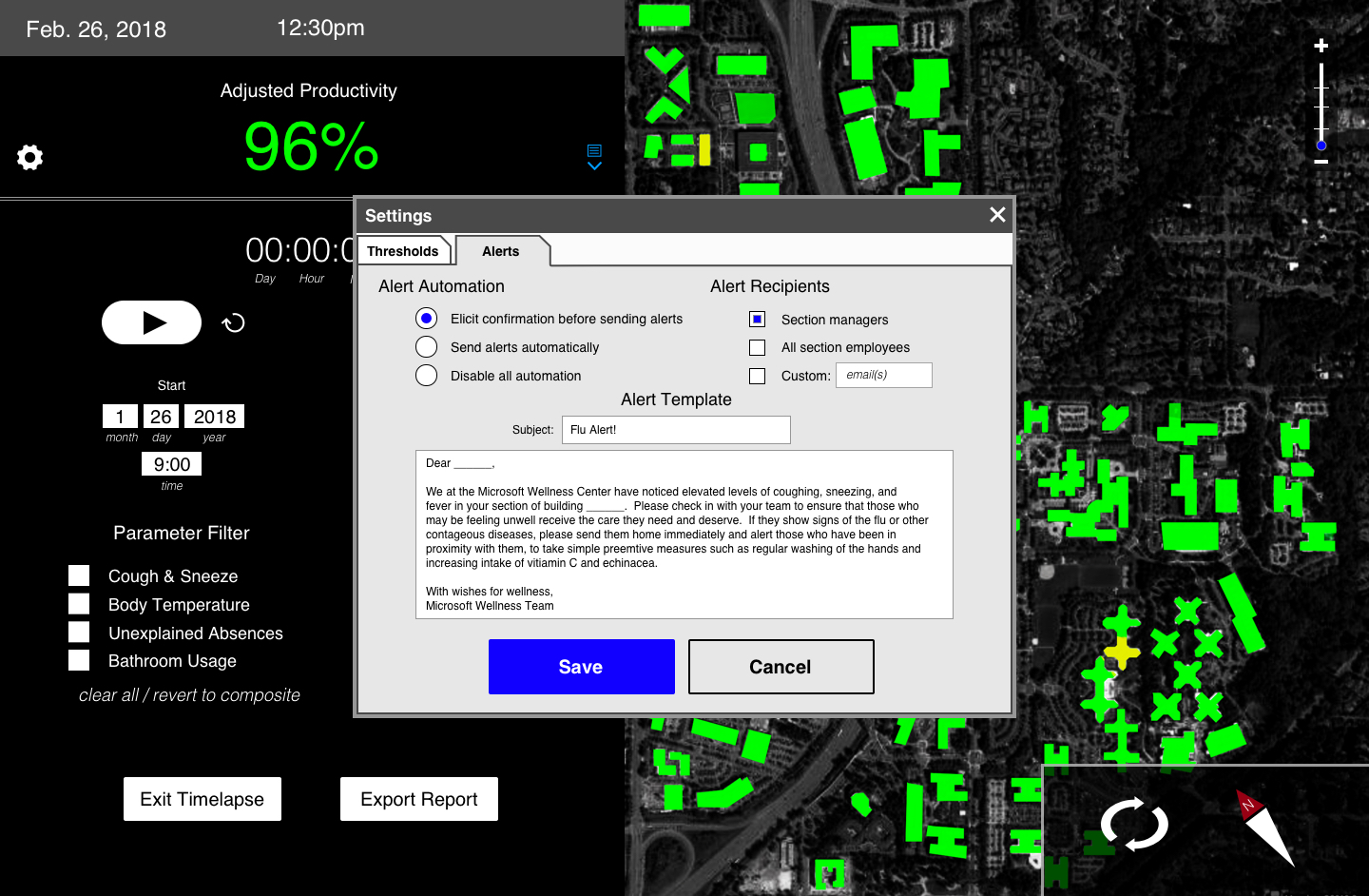
The settings panel needed two distinct functionalities. First, to allow the user to adjust the thresholds - effectively ajusting system sensitivity - to the four above-mentioned data points:

Second, the user must be able to customize the automatic message generated and sent to concerned parties when those thresholds are breached:
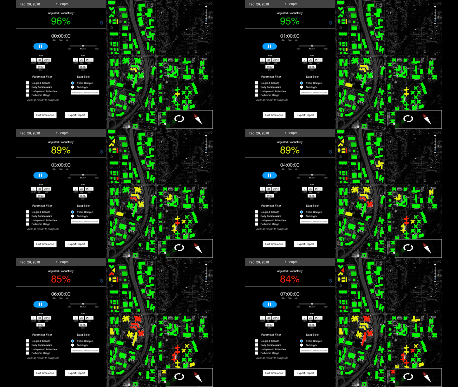
With usability in mind, I displayed the datasets in a simple, intuitive visual: color coded maps (green, yellow, and red) corresponding to the assumed health of an area based on the collected data.
Zoom Level 0
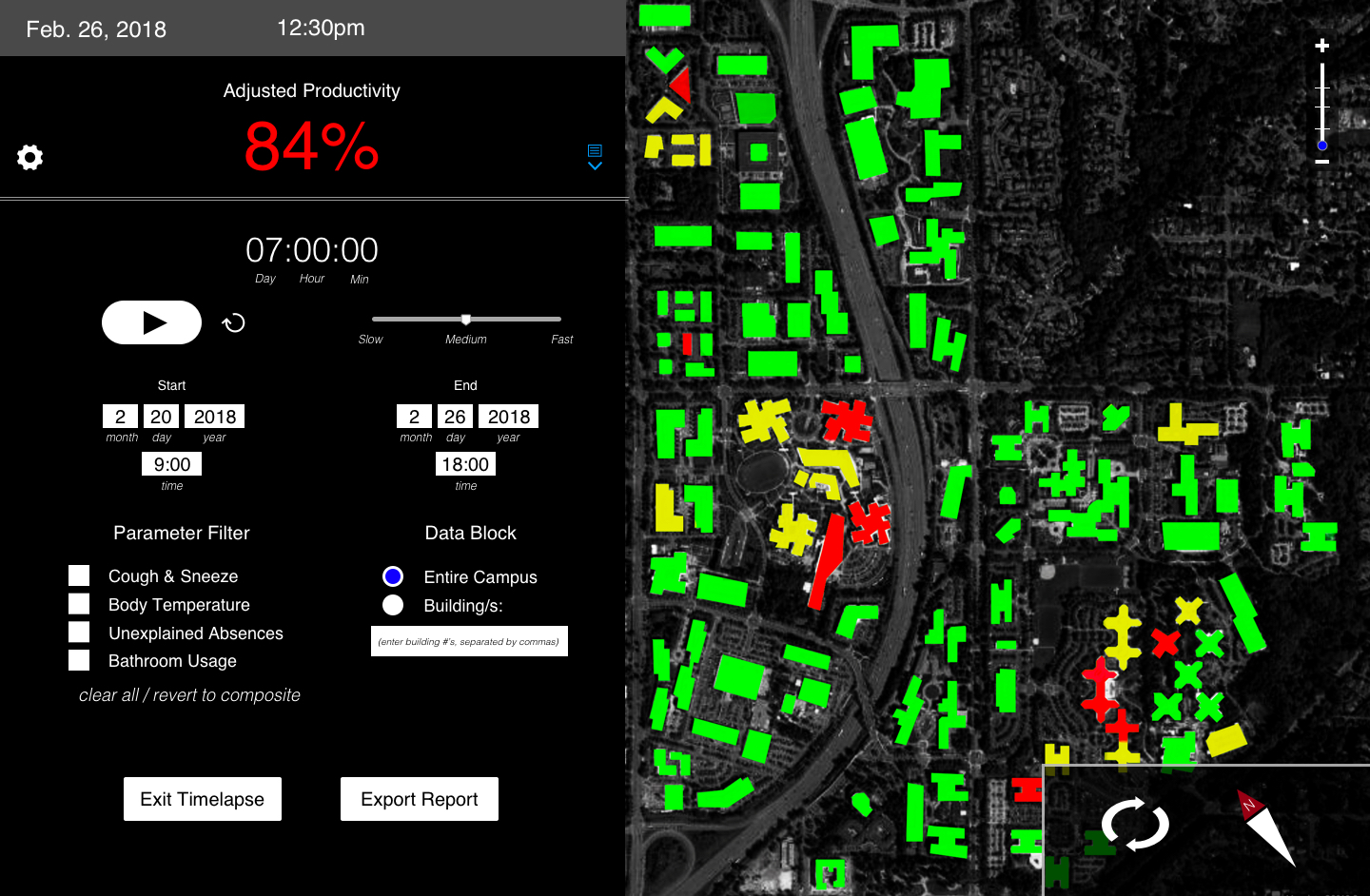
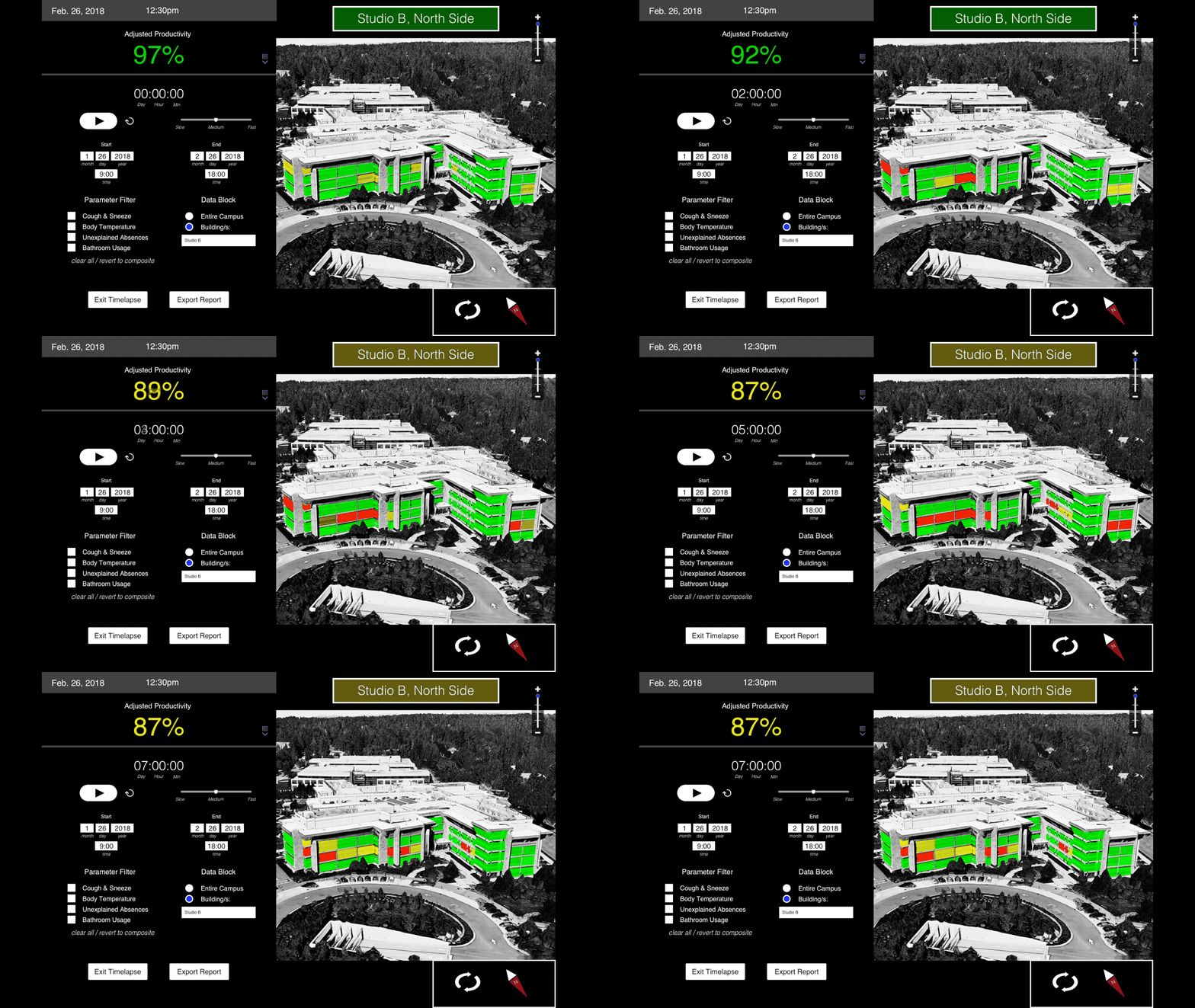
Requirements necessitated zoom functionality.
Zoom Level 2
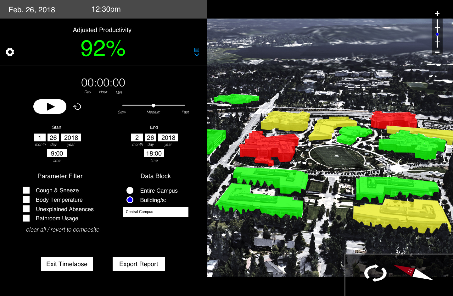
Higher zoom levels reveal more details of metadata.
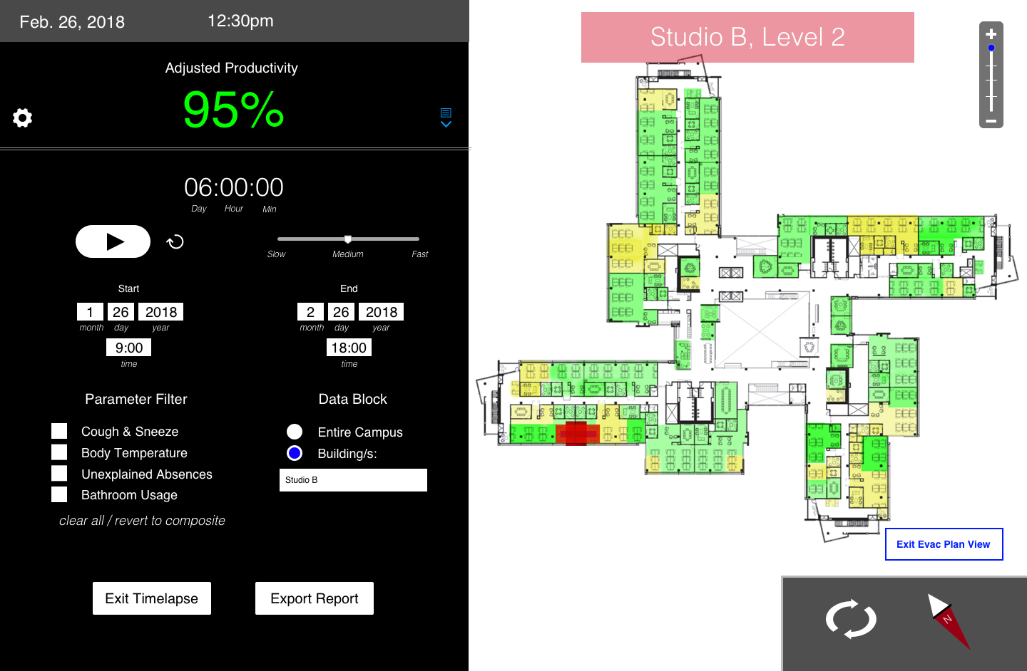
Zoom Level 3

Zoom Level 4
Using Adobe Photoshop and InVisionApp, I created a prototype of the system and recorded videos of users clicking through it; these videos were then presented to the stakeholders.
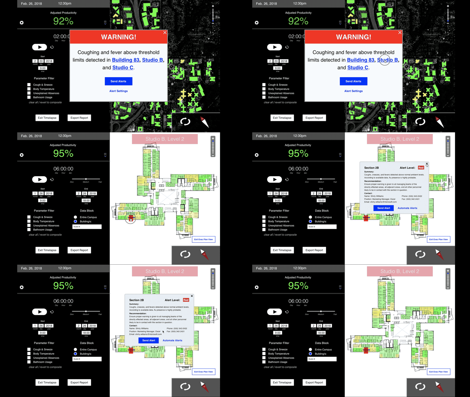
I animated the timespan functinality and included it in the prototype.
