Please make your browser window wider to view this content!

Screenshots are hard to view if the browser window is too small. Please ensure your window has a minimum of 1100px width to view this content. Thanks!

An extremely complex IT automation platform – whose UX deficiencies obscured its fundamental value – receives dramatic, much-needed redesigns, and a swath of new product features.

Low Hanging Fruit, High Impact

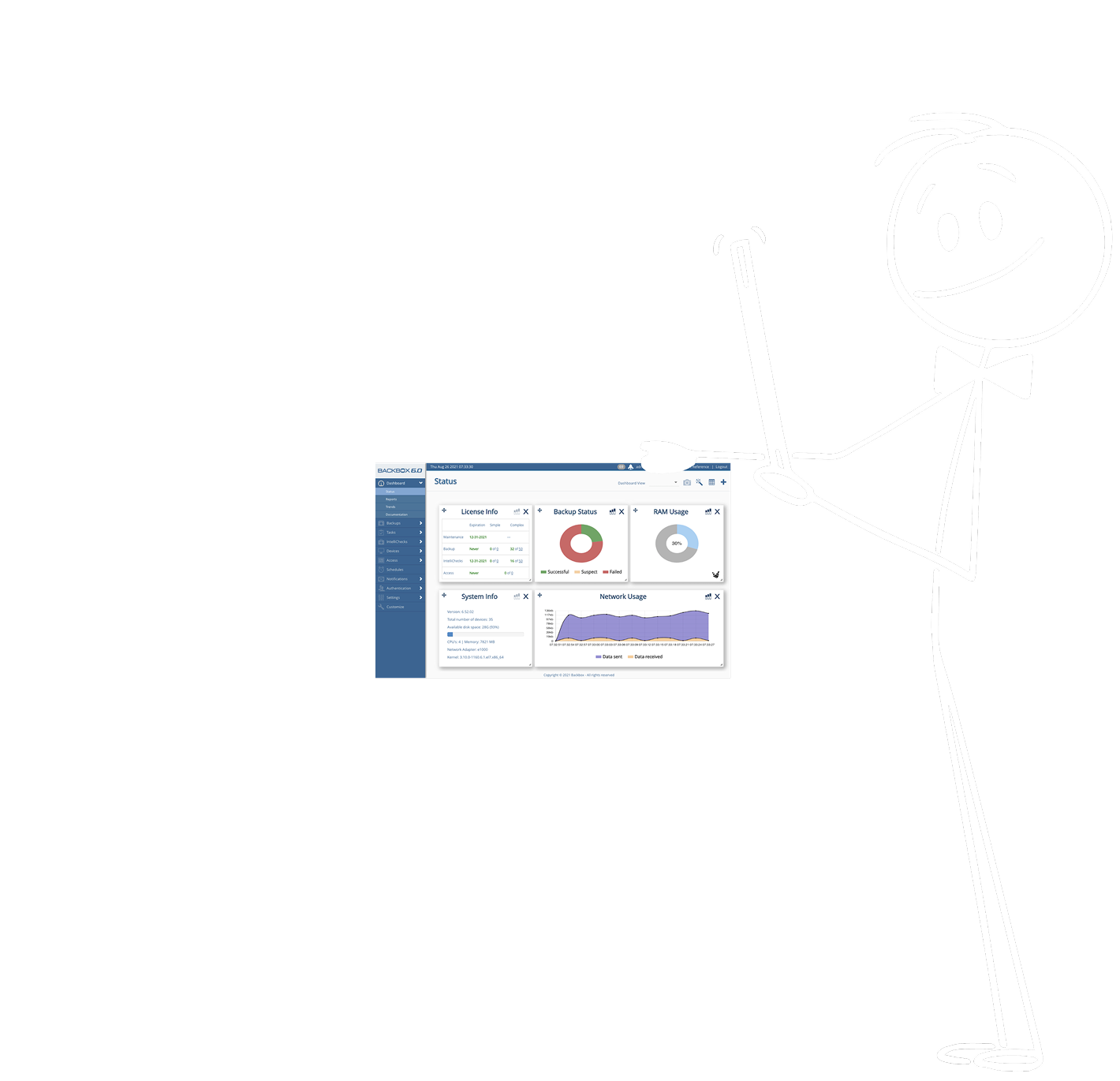
User Dashboard: Before

Let’s play “Spot the Problems”!

Click on the image to reveal the old Dashboard’s misdesigns

New Game!

Keep clickin'!

Problems Spotted!

2 / 10 problems spotted

  • Insufficient contrast between text and background color = difficult to read and inaccessible to those with vision impairments.
  • Menu items are crowded and have no clear hierarchy or organizational rules = overwhelming and hard to digest.
  • Unnecessary text crowding the landscape = overwhelming and subconsciously off-putting.
  • Pie charts are ellipses (not circles)!
  • Colors are inaccessible to color blind users (check out “Backup Status” pie chart in this simulation!).
  • Inconsistent, disharmonious padding between widgets, and overly dramatic drop shadows = off-putting and unpleasant.
  • Alerts don’t look like alerts (color too neutral).
  • Meanings of icons are unclear.
  • Strange gap between logo and top menu bar.
  • Colors and typography are not at all according to the styleguide!
User Dashboard: After

(that is, after 'just enough' iterations, prototypes, and user interviews)

Problems Fixed: *

  • Text is easy to read and accessible
  • Main menu is organized, simple, and clear
  • No unnecessary elements cluttering the view
  • Consistent padding and harmony between elements
  • Strange gaps and drop shadows removed
  • Visual cues are intuitive and follow best practices
  • Colors are accessible for users with color blindness
  • Pie charts are circles (not ellipses)
  • “Street Signs” (top center) give context and help orient the user
  • All colors and typography are according to the style guide

*The spreadsheet of CSS changes I created to help dev implement these changes can be viewed here

The Dashboard redesign was a quick, major improvement and received widespread praise from users. It's just one example of many low-hanging fruit I tackled as Design Lead at BackBox. If you'd like to hear more about how I identify and quickly compose delicacies of easily-harvested produce, please reach out!

Major Designs and Reworks

IntelliChecks

Background Story

We, the product team, through intensive user research and much discussion (re: resource allocation, ROI, competitive analysis, business realities, etc.), identified a product feature (“IntelliChecks”) that was theoretically very valuable but lacked proportionate user adoption because its poor UX failed to answer the following two questions:

  1. What the heck is an IntelliCheck?
  2. How the heck do I use one?

It was clear to us that the solution to the feature’s poor adoption metrics lay in redesigning its UX in such a way as to answer the above questions visually and intuitively.

To achieve this improved UX, however, was no simple matter. The feature, it turns out, was initially poorly designed because its use cases and functionalities are extremely complex, and rigid existing backend structures further complicated the task.

Note: there’s always a reason things are the way they are. Understanding these reasons is crucial to innovation.

Starting Point

The Old IntelliChecks Design

Notable Takeaways:

The operations which compose “IntelliChecks” can be split into three main categories:

  1. Device Inventory inqueries
  2. Performance checks
  3. Compliance checks

Compliance checks themselves can be further split into various categories, such as:

  • CIS Benchmarks
  • HIPAA Standards
  • Device Health Status (which must be customizable)

To the software engineers who developed this feature, all the operations are fundamentally similar (they are all scripts that check devices for data and meta data), hence they were all placed within the umbrella term “IntelliChecks”.

However, to your average user accessing these features through a GUI, neither the feature’s name, “IntelliChecks”, nor the feature’s ambiguous IA/UI give sufficient context or explanation, leaving the user feeling disoriented and clueless. The absence of an intuitive flow to the UX further compounded these issues.

Solution Hypothesis:

Create a UI/UX that clearly communicates to the user the intended functionality and range of use cases of “IntelliChecks” through the use of categorization and visualization, while guiding them through an intuitive flow.

One Tricky Thing:

While IntelliChecks’ thousands of operations could be categorized into sets in order to help the UX, we still needed to give the user the ability to customize these operation sets, each operation’s critical variables, as it relates to a particular device, for potentially tens of thousands of devices.

Rapid Prototyping
Iterations Later...

After gathering, processing, and iterating upon lots of feedback from users, stakeholders, and our dev team, I whittled down the design to be empirically intuitive, usable, marketable, and developer-friendly. The resulting design seems simple, but the underlying functionalities/requirements are extremely complicated, reflecting an important principle: The mark of good design is that it appears simple, despite underlying complexities.

View Final IntelliChecks Prototype
I'd like to call attention to:

This Device-Signature Map design is my novel approach to consolidate and make intuitive a process which was previously near impossible for users to navigate. I am particularly proud of this design, as it shows depth of technical understanding, heuristics, usability, and lateral thinking (if I may say so myself), while representing a quantum leap forward in usability for a very important feature.

The categorization of signatures into various easy-to-understand sets places the feature’s value proposition front and center, while eliminating all doubt and ambiguity as to the feature’s functionality. This, combined with the above Device-Signature Map, allows the user to quickly and intuitively navigate a fundamentally very complex task (by providing system defaults), while maintaining ultimate customization to fit the seemingly endless variety of use cases found in the real-world lives of network admins.

Major Designs and Reworks

Device Discovery

Background Story

BackBox, an automation platform for IT networks’ devices’ backups and operations, must gather various data relating to the devices in order to reference the relevant scripts/operations. Thus, the collection of this data is the starting point of any network admin who wishes to onboard their networks to the BackBox platform.

Therein lay a major problem: there was no simple way to accomplish this data collection, because:

  1. The data, on BackBox’s side, were not normalized, causing mismatches and undefined results.
  2. The device discovery engine was unreliable.
  3. BackBox’s GUI was not designed to account for the above, did nothing to alleviate the problems, and in fact exacerbated them with a shockingly dysfunctional UX.

The implication of the above is:

The literal entry point for a first-time user provided a mind-numbingly frustrating UX, chalked full of error, frustration, and lack of user feedback, leaving the first-time user dismayed, frustrated, and unimpressed.

Starting Point

The Old IntelliChecks Design

Notable Takeaways:

  • The operations which compose “IntelliChecks” can be split into three main categories:
    1. Auto-add devices
    2. Add devices by rules
    3. Scan network and manually add devices
  • Each of the above methods returns different sets of data requiring unique actions by the user.
  • The user requires a UI with which to manage devices which are incompletely and/or incorrectly discovered.
  • The user requires a way in which to ignore certain IPs from being scanned, a way in which to manage these IPs, and feedback when these IPs are scanned but ignored.

Goal:

Create a UI which accounts for all of the use cases and technical requirements found within Discovery, while providing a UX which flows naturally and remains intuitive.

A Tricky Thing:

The complexities of Discovery are even greater than what’s reflected above. Ensuring the user can achieve all their goals while receiving relevant feedback and maintaining flow, in the face of these complexities, was very difficult, requiring a lot of lateral thinking, collaboration, and iteration.

Rapid Prototyping
Iterations Later...

After gathering and iterating upon feedback from users, stakeholders, and our dev team, I whittled down the design to be demonstrably intuitive, usable, and pleasant. As with IntelliChecks, the resulting design seems simple, but the underlying functionalities/requirements are very complicated.

View Final Discovery Prototype

Note: when you change the “Import Method” and then click “Run Now”, look carefully – you will see many subtle but essential UI changes in the user flow, an example of the feature’s many underlying intricacies.

Dev Team Collaboration

The complexities in this design are subtle and numerous. As such, I foresaw difficulties in the design’s development and created for the dev team a thorough list of details at high risk of being overlooked. Additionally, I worked alongside the developers to ensure they developed the feature according to design, supplying them with detailed spreadsheets of CSS corrections as they progressed, assuring the final product was pixel perfect, polished, and pleasant. You may view one such spreadsheet of CSS changes here.

I'd like to call attention to:

Automated Device Discovery for large multi-vendor networks is a complicated task for which to design. The trickiest things we needed to figure out were:

  1. How do we handle results that don’t match our database? Indeed, BackBox’s discovery engine did not allow for fuzzy matching – the results gleaned from device queries needed to match exactly our non-normalized, non-standardized database for thousands of devices and hundreds of vendors.
  2. How do we communicate to the user the above information/difficulty clearly and concisely, without causing needless frustration, while allowing for user correction?

These two screenshots are my design’s approach to solve for the above-mentioned difficulties, an approach validated by prototypes and user interviews, in which users emphatically approved of this intuitive, usable, flexible solution.

It is worth mentioning that through my research, design process, and collaboration, we also evolved our approach to handling this data so as to incrementally reduce the frequency of mismatches the system would return. This is one illustration of the differences between Product Design vs. UX/UI Design: Product Design is holistic and brings clarity to the entire product, not just the GUI.

Major Designs and Reworks

Network Vulnerability Manager

Background Story

BackBox is able to query thousands of devices from hundreds of different vendors and dynamically inventory the specifics of these devices (OS version, model, etc.). If we could combine this capability with an aggregation of all available vulnerability data in the known universe, the result would be a very powerful, very valuable integration. Thus, when a company which specialized in just such an aggregation approached us for just such an integration, we were all very excited.

Alas, all great things have their obstacles. In this case, they were many:

  1. The data BackBox gathered from devices was not normalized/standardized, creating difficulties in processing and mapping that data to the vulnerability data.
  2. The simplest path forward from a dev point of view was untenable from a usability point of view.
  3. We were given about a month in which to get this all done, and at the time, Product Management's bandwidth was 100% with other high priority projects. Therefore, there was a lot of pressure to go with the simplest path forward, despite it being a major usability fail.
  4. To top it off, the use cases and requirements themselves were quite complex.

As Design Lead, I am the users' champion. As such, I have a responsibility to push back in such cases – to declare that there are minimum requirements of usability which we must uphold. I knew this argument would not be particularly popular, but I also knew that it would be much more palatable if I had a working plan and clear vision. Thus, I filled a large pot of coffee and sat down with our lead developer to discuss a very clever plan (if I may say so myself) I cracked up, and how we might accomplish it within the very tight timeframe allotted us. One very long night later, we had a documented plan. Two days later I had a working prototype. A week later we had tested that prototype and started on its development.

The above story serves as another good example of the difference between Product Design vs. UX/UI Design; Product Designers share Product Management skills, such as technical prowess and business acumen, allowing deep collaboration, holistic perspectives, and creative solutions to complicated product challenges.

Happy Dev Team, Happy Users

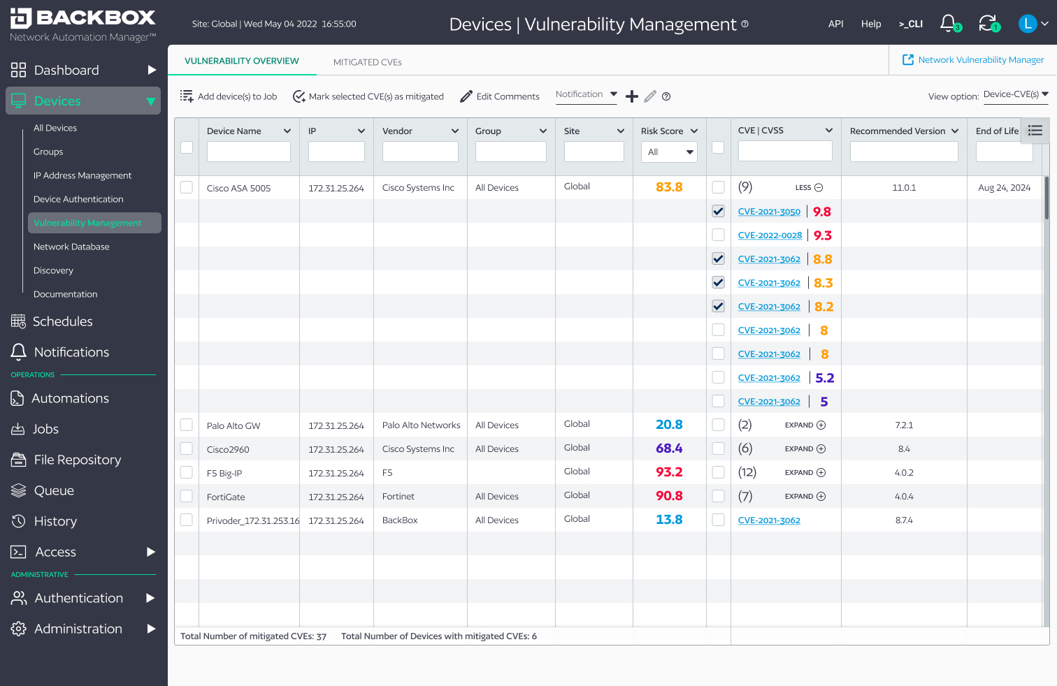
The following design was a brand new feature, crafted under intense time pressures. Nonetheless, I sacrificed nothing, and, indeed – in close collaboration with my dev team counterparts – provided a vision and prototype optimized for both ease of development and intuitive usability. It consists of three flows:

  1. 1. The NVM Job Configuration (how a user onboards specific devices into NVM):
  2. NVM Job Configuration Prototype
  3. 2. NVM Overview (how a user visualizes and interacts with NVM and its data):
  4. NVM Overview Prototype
  5. 3. Empty state of NVM (what the feature looks like when NVM license is not active):
  6. NVM Inactive License Prototype
I'd like to call attention to:

This frame, while seemingly simple, represents a very clever approach from both an information architecture (IA) and backend perspective:

While BackBox could gather device data through the use of scripts (using an IntelliChecks Job), I chose to give these scripts their own Job type. In so doing, I created a feature that relied on existing backend capabilities while providing an imminently intuitive UX for the user. It also allowed us to more easily create and track unique communications between platforms while increasing the feature’s future flexibility and scalability.

The original plan was to gray-out the NVM feature if the user did not have the required license type. However, I saw an opportunity to educate users about the new feature (thereby to sell it), so I designed this sales carousel for the NVM inactive state. In addition to scoring points with the marketing team, this is another example of Product Design vs. UX/UI design. Such initiative is typically found within the realm of Product Management or Sales. As a Product Designer, I not only look for opportunities to improve UX, but also to market and sell the product, as a product manager might, bridging roles in a uniquely valuable way.

Other Achievements & Responsibilities

Device-files search

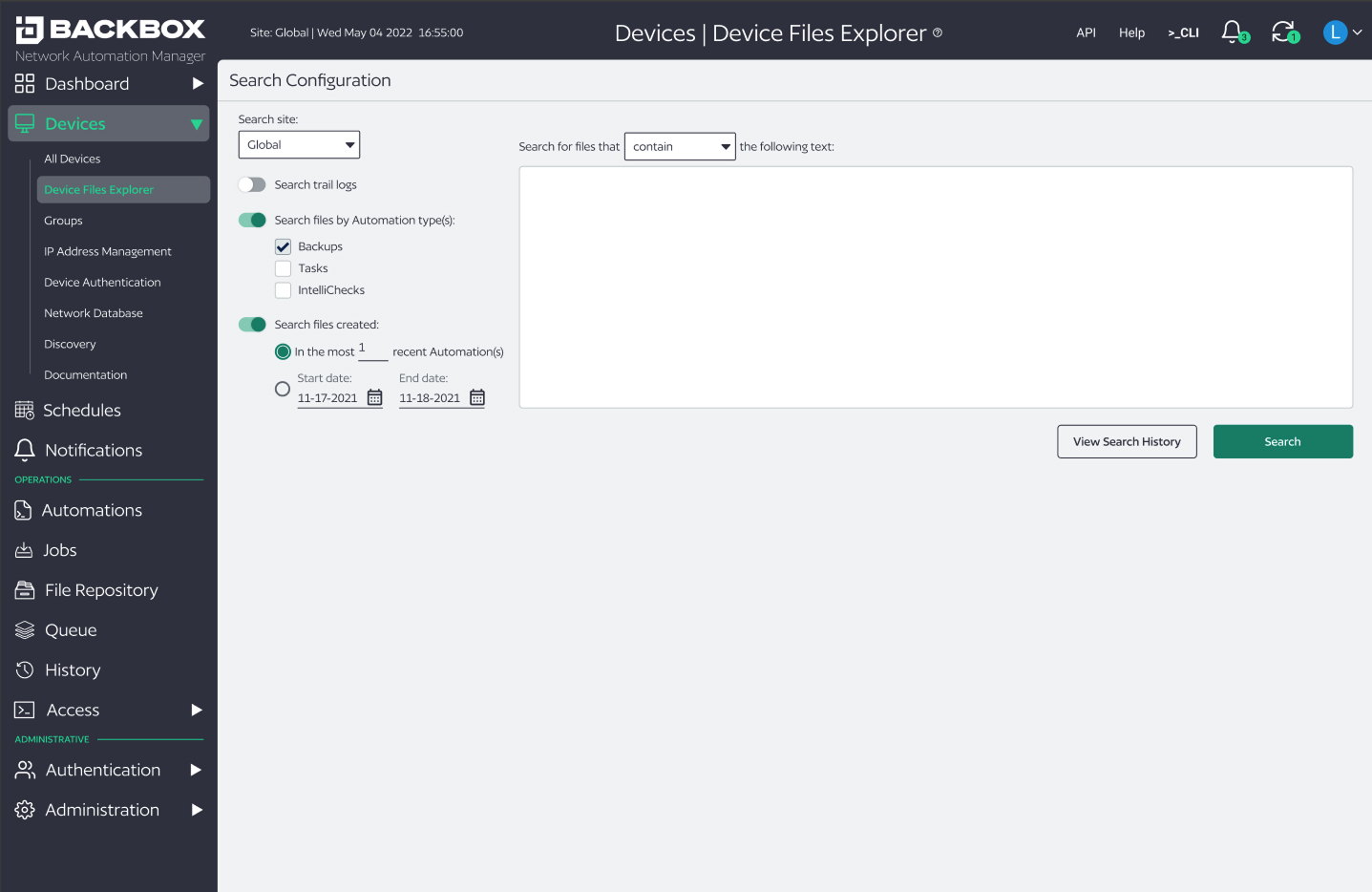
Born from a feature request from one of our power users, the capability to search backup files for a string of characters is very powerful in the hands of a large network admin who, for example, might want to know which devices’ configurations contain certain parameters. The technical realities, however, make implementing such a feature more difficult than you might think, since the amount of data to be searched could quickly become overwhelming. We overcame many of these difficulties by utilizing thoughtful design coupled with deep collaboration with engineering (for example, default filter states and helpful user feedback). See the final prototype here.

Variables

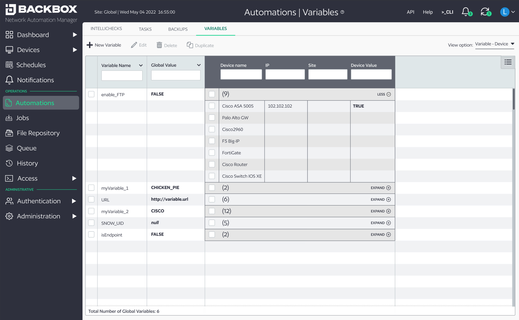
Also as a result of our efforts to create a more flexible, scalable product, we created the ability to create and manage custom variables and values to be utilized in automations be accessible via API. The concept of variables, as you dig into it, is extremely complicated, made more so by the hierarchies inherent in BackBox itself.

Shameless brag: I was essential to this technical discussion. Subsequently, I designed two variations: one for a hierarchical model, in which the value for a variable at a device level is separate from its global value (and whose design you can see here), and another model for a non-hierarchical model, in which a variable has only one value regardless of its site, but whose “scope” could be set to “site” or “device” level. We ended up using the non-hierarchical model, as it was simpler and more intuitive. See the final non-hierarchical model prototype here. (Read the tooltips in the variable configuration view to get a sense of the underlying complications, and how I communicated them to the user.)

Tags

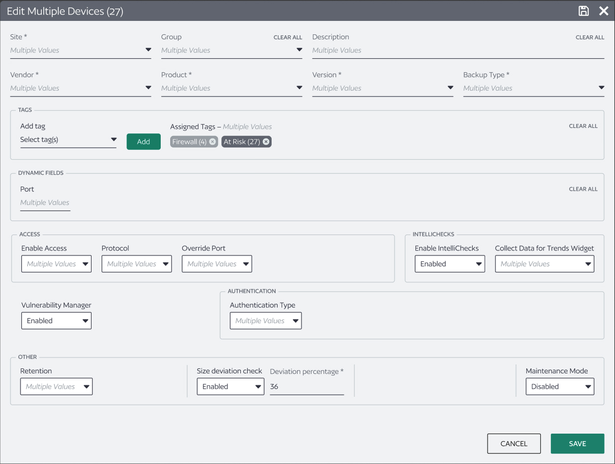
In our efforts to create a more flexible, scalable product, we created the ability to assign devices customizable “tags”. These tags needed to be operable, and thus showed up in various places throughout the product (in Automations, Jobs, singular and multi device view, device discovery, as well as a few other places), each with their own implications and requirements, the details of which I’m not going to get into here. Suffice it to say, it’s more complicated than it seems on the surface (as usual). See the final prototype here.

API Token Manager

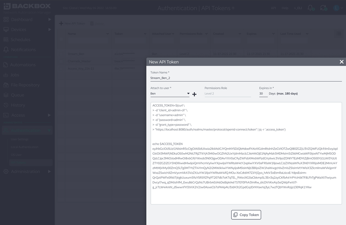
Another feature request from one of our power users, the capability for admins to create and manage API Tokens for lower level users was a powerful addition, especially for our enterprise customers with large, multi-level IT teams maintaining very large networks. See the final prototype here.

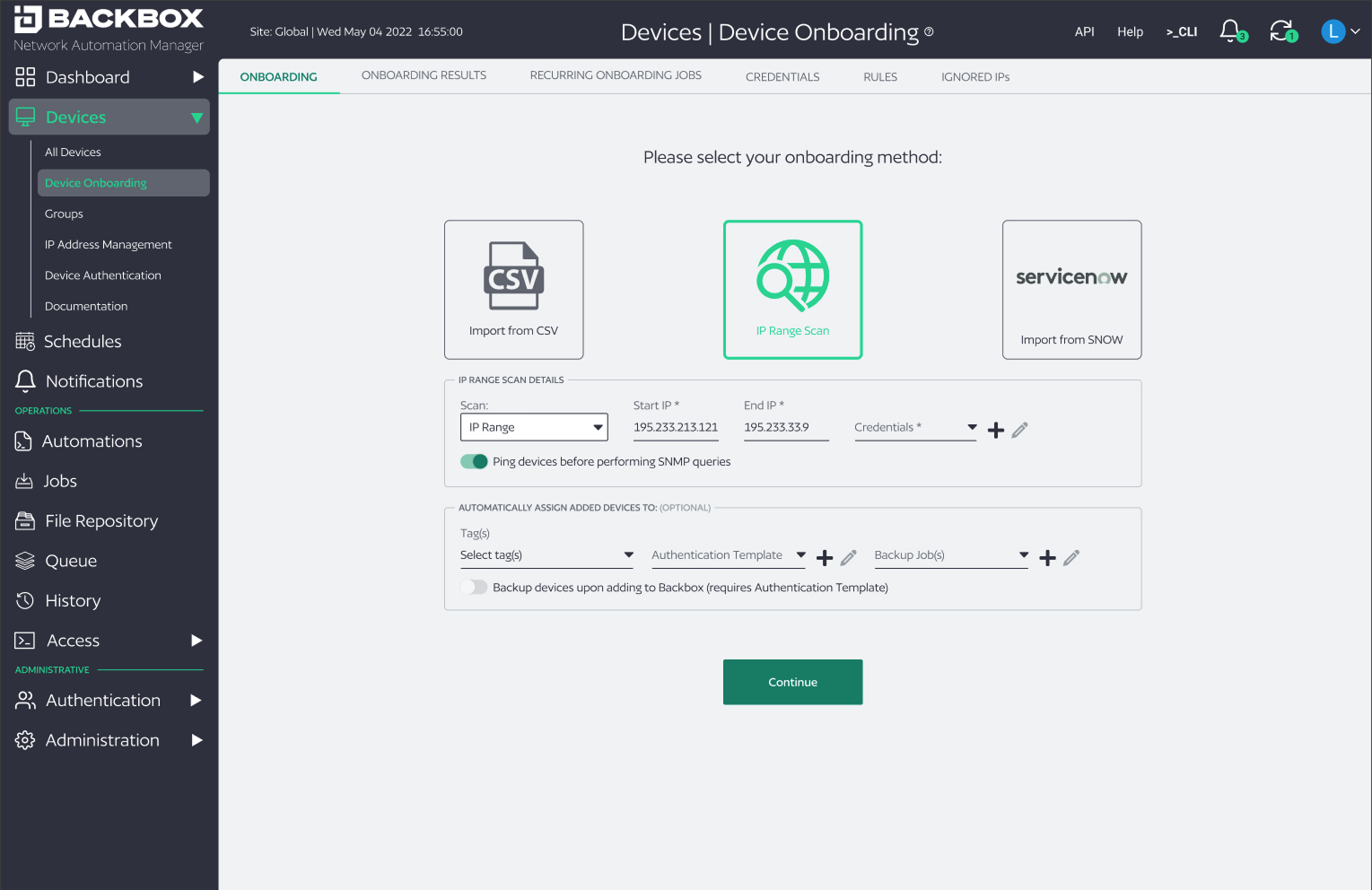
Unified Device Onboarding

We were tasked with developing an integration with very popular workflow automation platform ServiceNow (the requirements of which, interestingly, prompted our development of tags and variables). One of the implications of this integration was a need to onboard devices from ServiceNow into BackBox, which got us thinking about onboarding devices in general, and that there was an opportunity to simplify that process by unifying the different methods. Building upon the Discovery Redesign, I quickly drafted this mid-fi mockup (it took me only one day) to help us visualize the details of how such an unified onboarding flow might look. View the mid-fi (i.e. not entirely polished) prototype here.

Complete BackBox Redesign

This was our project “X”: our experimental, no-holds-back, drastic reimagining of what BackBox’s GUI could potentially be. Unfortunately, the reality at BackBox did not allow for us to develop this vision into real-life product, but nonetheless our musings helped direct overall vision and provided a sense of excitement for the future, a future in which our GUI actually reflects and harmonizes with the powerful underlying feature set it controls. It is not without some deep regret that I say we were unable to develop this vision, as its ease of use and imminently practical method of visualization would have revolutionized the lives of many enterprise IT admins and MSPs the world over.

Website Redesign and Copy

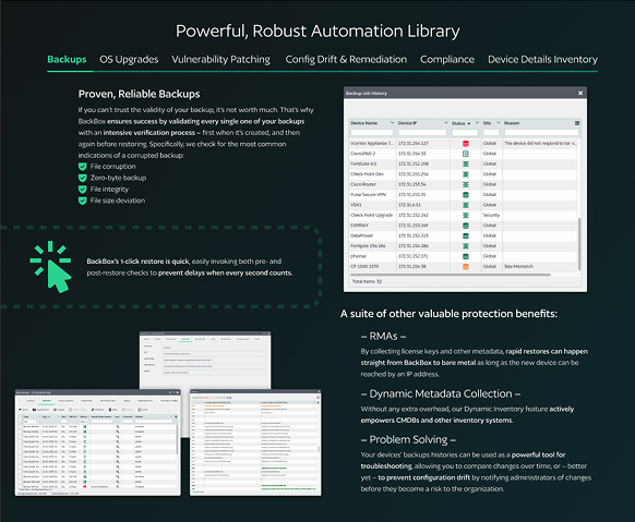
The state of BackBox’s website was a sorry one when I first showed on the scene. It did little to promote the platform’s unique value propositions; indeed, it was missing basic information. There were no compelling design elements, and the few visuals it did have accomplished little by way of explanation, much less encourage conversion metrics. Therefore, in a lull between product projects, I offered to the VP of Marketing to assist with a website redesign. It was an expedited project; the entire goal was to improve the website incrementally, which was not very ambitious, considering its lackluster state. Nonetheless, I drastically edited all the copy, composed all new visuals (that made sense and actually served their purposes to educate and sell), and turned out an effective, clear, and responsive design within about two weeks. You may view the prototype here. While you're there, check out the graphics in the Automation Library section (sub-headings are clickable). I think they're pretty cool :)

Styleguide Enforcement and Componentization of BackBox Platform

As Design Lead, I was also responsible for ensuring consistency of all style-related items and UI components. To this end I componentized – in Figma – all UI elements of the BackBox platform and created a spreadsheet of in-product UI elements that breached those guidelines, working with dev to affect their remediation.

User Personas

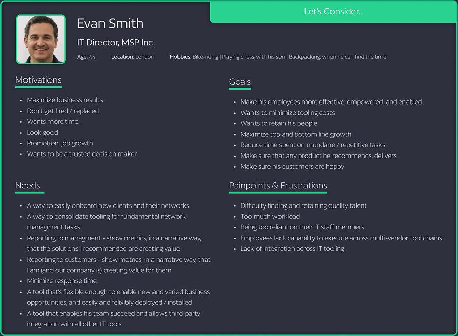
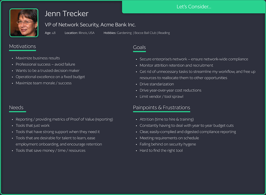
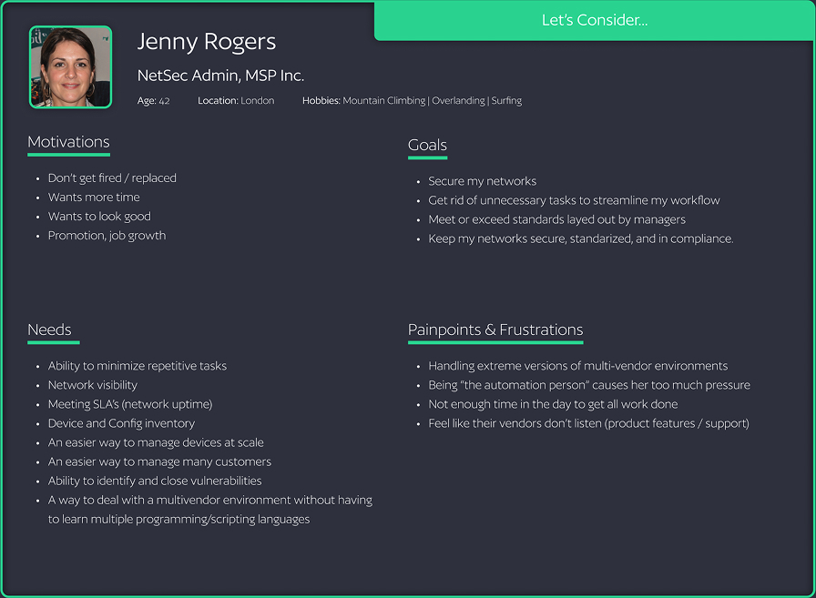
One of the first things I did when I arrived at BackBox was the creation of user personas based on user research and the seasoned experience of our product, customer service, and sales teams. This directed not only my design efforts for all the subsequent projects, it also was helpful in spurring cross-departmental discussion and helping the entire team think more deeply about our users and their humanity: their motivations, needs, painpoints, and goals.

Wow!! Are you really still here??

If you’ve made it this far (thank you for reading!!), you must really be interested in my work! If that’s the case, why not reach out and we can continue the discussion?

Let's Connect!